
Flowers
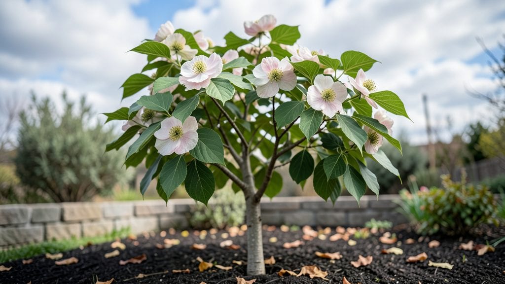
Painting dogwood flowers requires layering translucent washes for petals, using dark outlines for definition, and blending soft highlights to capture their delicate texture and subtle pink-to-white gradients. Start with a light base and build depth gradually.
Dogwood petals are all about capturing that ethereal translucency—think of them as delicate pink glass catching the light. 🌸 The secret lies in using thin glazes of watered-down paint (like a 1:3 paint-to-water ratio) to mimic how sunlight filters through real petals.
I always start with a pale pink base, then gradually darken the edges while keeping the centers luminous. This mimics how dogwoods naturally fade from pink at the edges to near-white centers.
For that signature softness, a round brush (size 2-4) works best for petal shapes, while a filbert brush helps blend gradients seamlessly.
What trips up beginners is the veining detail—those faint, wispy lines that give dogwoods their lifelike quality. I recommend using a dry brush technique with a tiny round brush, gently tapping the edges of petals to create subtle texture.
And here's a pro tip: mix a touch of white gouache into your darkest outlines to prevent them from looking too harsh against the pale petals. The goal is to suggest depth, not outline like a cartoon!
💡 In This Article
- Dogwood Flower Color Theory for Realistic Blending
- Essential Brushes and Mediums for Dogwood Petals
Dogwood flower color theory for realistic blending
Dogwood petals exhibit a fascinating optical phenomenon called translucency, where light passes through their semi-transparent structure. This creates their signature soft glow, with pink hues appearing more intense at the edges while fading to near-white centers.
The color science involves subtractive mixing—real dogwoods don't contain pure pink pigment but rather a combination of red and blue undertones that blend optically.
When light hits these petals, the red wavelengths reflect more strongly at the edges, while the blue undertones dominate in the centers, creating that gradient effect.
The key to replicating this is understanding color temperature shifts. Dogwood petals often have warm pink edges (with yellow undertones) that transition to cooler, almost lavender centers.
To mix this naturally, start with a base of cadmium red light mixed with a touch of ultramarine blue (about 70% red to 30% blue), then gradually add more white as you move toward the center.
For that signature translucency, thin your paint with a glazing medium to about 30-40% opacity—this mimics how real petals allow light to filter through.
Light reflection plays a crucial role in achieving depth. Dogwood petals aren't flat surfaces—they have subtle three-dimensional curvature that catches light differently.
When painting, work in three layers: first a base wash (thinned paint), then midtone glazes to build depth, and finally highlight glazes using a mix of your base color with a tiny bit of white.
The highlight should never be pure white—think 90% base color to 10% white—to maintain the natural translucency. This layered approach creates the illusion of light passing through the petals, rather than sitting flat on the surface.
Here's what's actually happening with those gradients: dogwood petals have iridescent properties that shift slightly depending on the viewing angle. To capture this, use a dry brush technique with your darkest colors along the edges, then blend outward with progressively lighter mixes.
For the centers, add a touch of payne's gray (about 5% of your mix) to create that natural coolness. This subtle gray undertone is often overlooked but makes the white centers look more realistic.
Temperature also affects how colors appear. Dogwoods in full sun develop warmer tones, while shaded petals appear cooler. To simulate this, paint your petals with warm light (like a small desk lamp) to see how the colors shift.
You'll notice the edges appear more vibrant under warm light, while the centers stay cooler—a perfect guide for your blending. For extra realism, work on textured paper (like Strathmore 400 series) to mimic the natural irregularities of petal surfaces.
One common mistake is over-blending the gradients, which flattens the petals' natural texture. Instead, use a filbert brush to create soft, feathery edges between your color zones. Think of it like blending watercolors—let the colors merge naturally without hard lines.
For the veins, use a tiny round brush with a mix of your base color plus a touch of burnt sienna (about 10% of the mix) to create those delicate, wispy lines that define real dogwood petals.