Landscaping
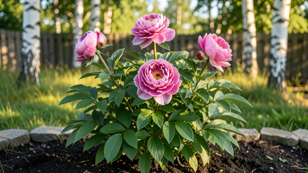
Flower landscape painting captures scenic beauty by combining botanical precision with atmospheric composition. Mastery comes from layering translucent washes for depth, using delicate brushwork for petals, and balancing warm and cool hues for lifelike contrast. Always begin with a faint pencil outline before developing shadows and highlights progressively.
Creating realistic flower landscapes in paint requires understanding how light interacts with natural elements. 🌸 The key lies in your brush selection—round brushes handle fine details like stamens, while larger flats create broad strokes for foliage.
I've found that watercolor's transparency works best for delicate petals, while acrylics offer more control for bold foliage textures. The magic happens when you layer colors gradually, starting with the lightest shadows and building to the darkest highlights, which mimics how sunlight would naturally fall across a garden.
What sets great flower landscapes apart is how they guide the viewer's eye through the scene. Classic botanical artists like Pierre-Joseph Redouté used warm tones in the foreground to draw attention, then shifted to cooler blues and greens in the background.
This color progression creates that coveted "depth" effect that makes your painting feel alive. 🌿 For beginners, I recommend practicing with just three focal flowers first—this helps you perfect the balance between individual detail and overall composition before tackling complex garden scenes.
💡 In This Article
- Choosing the Right Brushes and Paints for Floral Landscapes
- Step-by-Step Composition Techniques for Garden Scenes
Choosing the right brushes and paints for floral landscapes
The right brushes transform your floral landscape from stiff to lifelike. A round brush with 2-4 mm bristles excels at delicate petal edges and thin stamens, while its tapered tip allows precise control over curved shapes.
For broader strokes like foliage or grass, a flat brush with 1/2-inch width creates smooth, even coverage—ideal for capturing the texture of leaves or stems. The filbert brush, with its oval shape, bridges the gap between precision and coverage, perfect for blending petal shadows or painting flower centers.
Paint selection depends on the effect you want: Watercolor dominates for its translucency, allowing light to show through layers like sunlight filtering through petals. Its low opacity lets you build depth gradually—critical for realistic highlights.
Acrylics, however, offer high opacity and faster drying times, making them ideal for bold foliage or quick sketches. Pro tip: Mix watercolor for delicate petals with acrylic washes for background foliage to balance detail and speed.
Pigment opacity changes everything in layering. Transparent pigments (like quinacridone red) let light reflect off the paper, creating luminous petals, while opaque pigments (like titanium white) block light, perfect for thick foliage or shadows.
For realism, start with 3-4 light washes of transparent color, then add 1-2 darker layers—this mimics how natural light varies across a flower. 🌸 The key is patience: each layer should dry completely to prevent muddy colors.
Brush texture matters too. Soft synthetic bristles (like Princeton Velvetouch) hold more water, ideal for smooth gradients, while stiff hog hair brushes (like Da Vinci Casaneo) lift color better for bold strokes.
For fine details, a liner brush with 0.5 mm tip lets you define veins in leaves or tiny petal highlights without smudging. Test brushes on scrap paper first—some shed fibers that ruin delicate work.
Color mixing isn't just about blending—it's about temperature contrast. Warm tones (cadmium yellow, alizarin crimson) in the foreground draw the eye, while cool tones (phthalo blue, sap green) recede in the background.
For petals, mix 2-3 complementary colors (e.g., pink + blue) to create natural gradients. 💫 This technique tricks the eye into perceiving depth, even in flat compositions.
Advanced tip: Use a dry brush technique for texture—load your brush lightly and stroke dry paper to mimic rough foliage or weathered petals. This works best with acrylics or gouache, where pigment clings to fibers.
For watercolor, try salting (sprinkling salt on wet paint) to create organic, vein-like patterns in leaves.